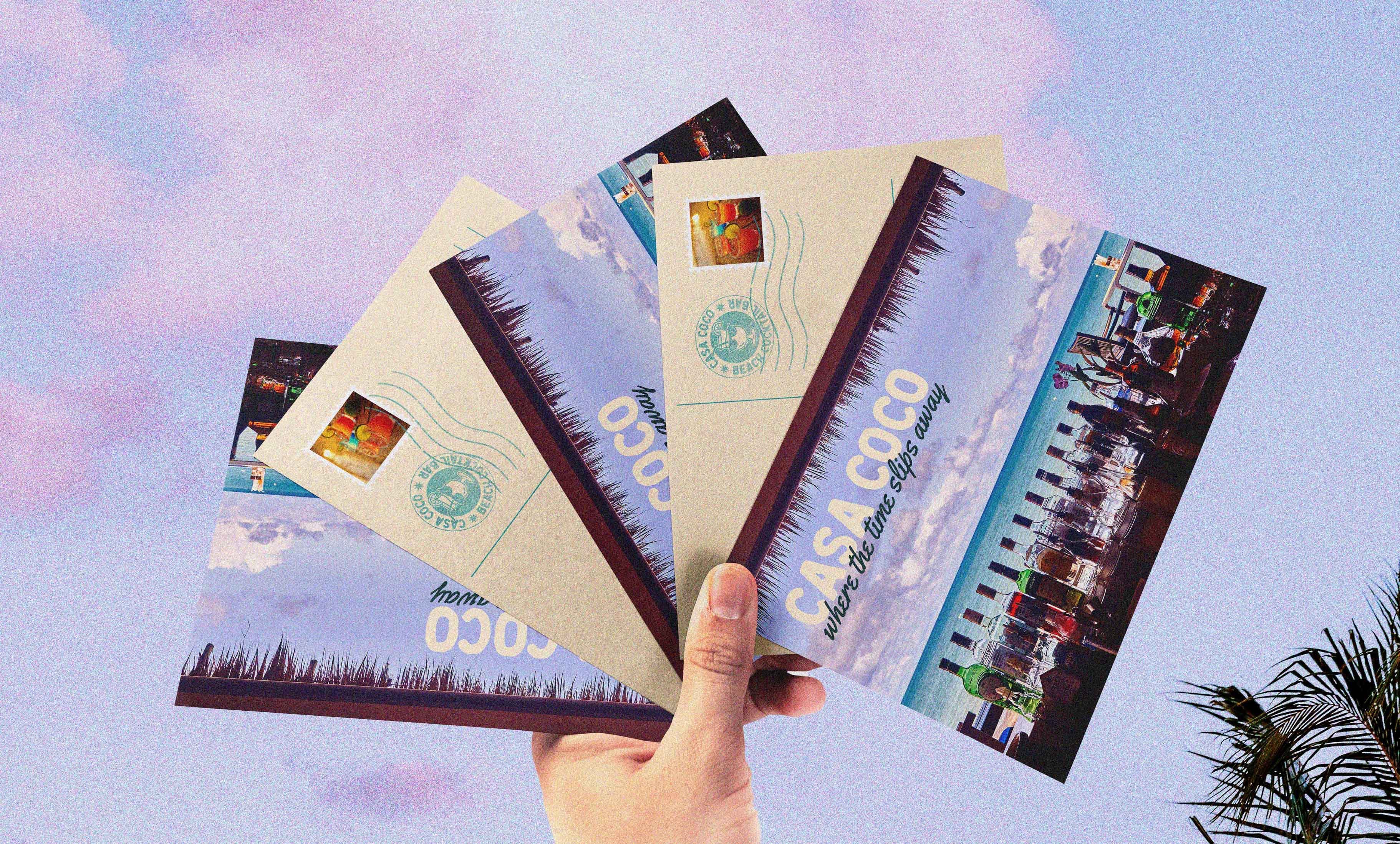
CASA COCO
Brand Identity
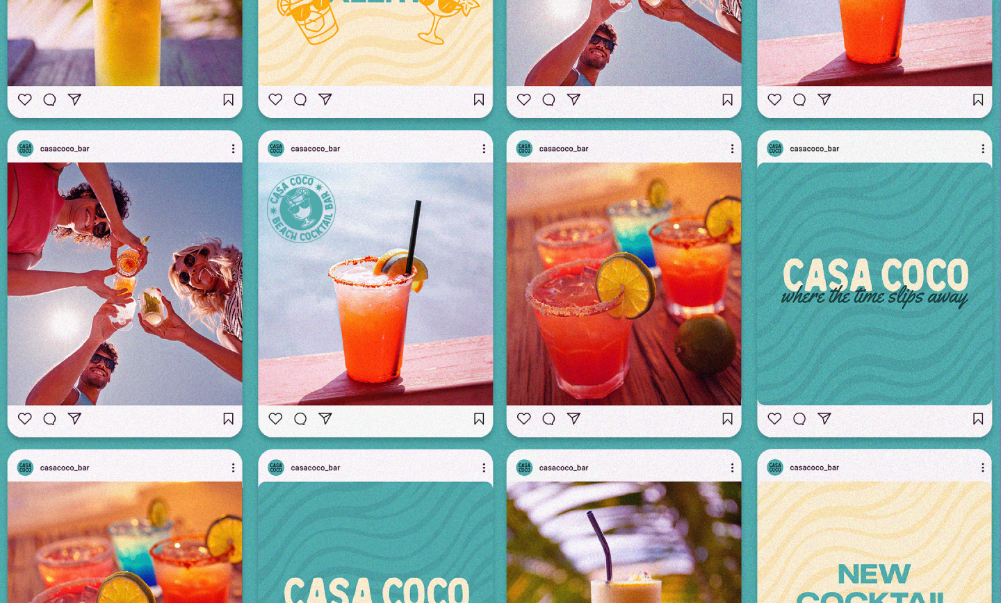
Social Media
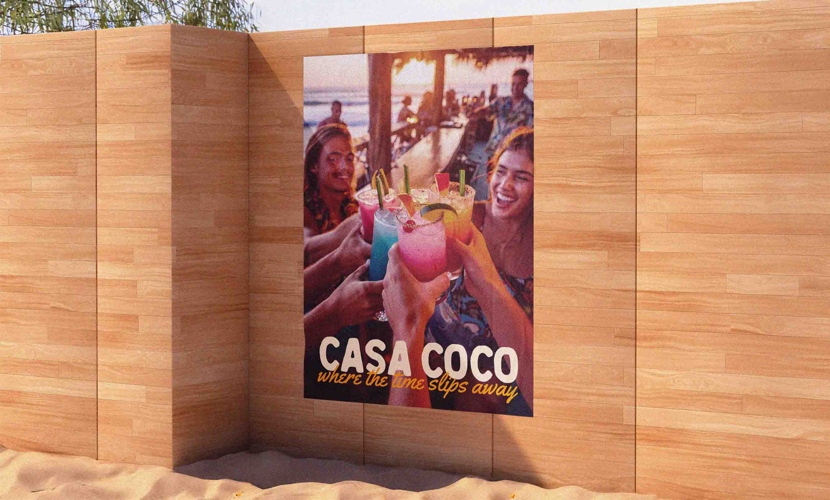
Casa Coco is a beach bar made for long afternoons and warm nights by the sea. With good cocktails, a laid-back atmosphere, and the sound of waves in the background, it’s a place where time slows down and conversations flow easily.
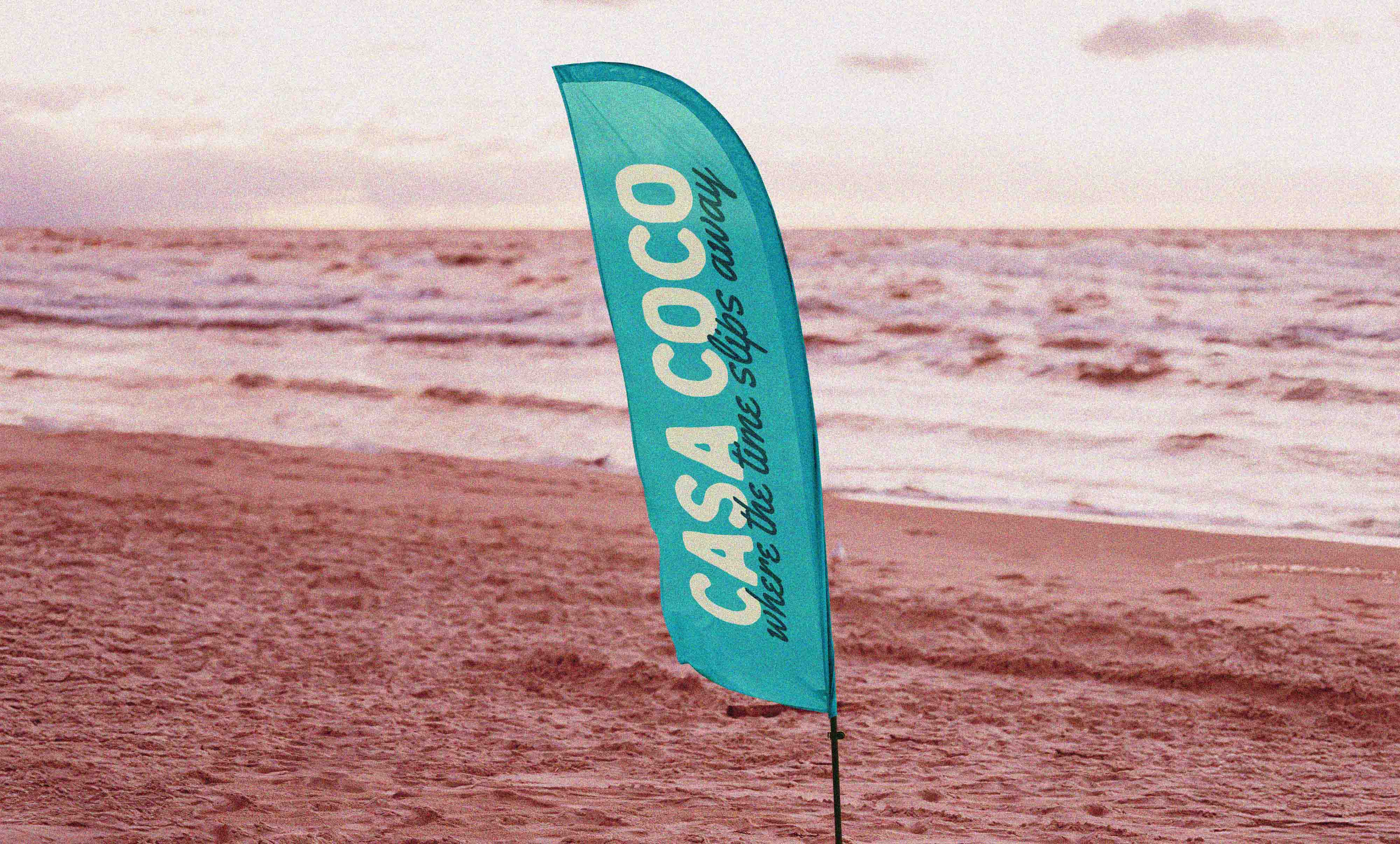
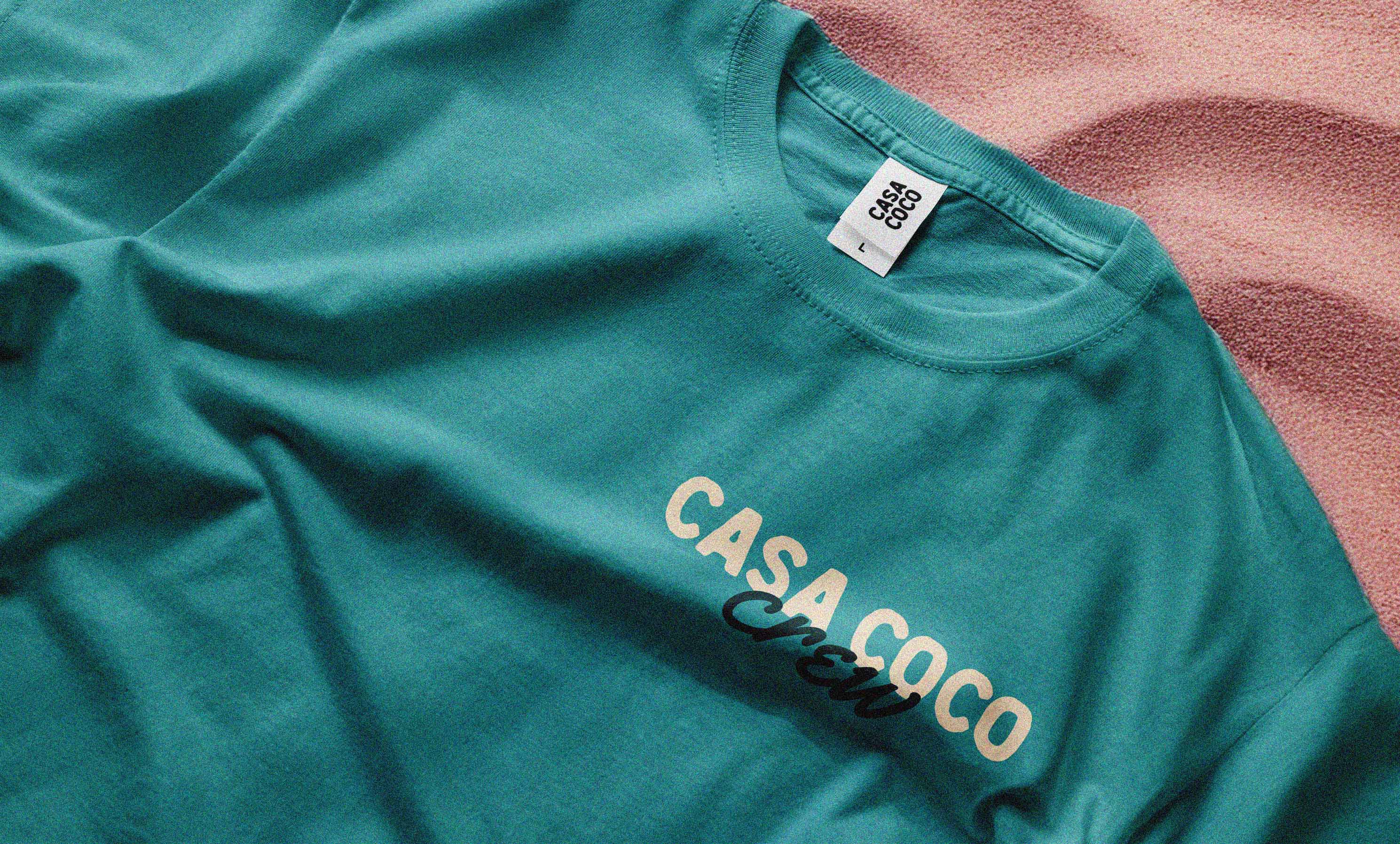
The goal of this project was to reflect the feeling of warm, laid-back summer evenings spent in good company through the brand identity. For the logotype, I chose a typeface with a rustic character and uneven edges that reminded me of the charm of a wooden beach bar stall. I paired it with a flowy, relaxed script as the secondary typeface, which felt like a handwritten note on a holiday postcard. To continue the theme of flow, I designed a custom pattern based on the wavy marks you see on the sea bottom. Finally, I created illustrations of drinks as little characters in sunglasses, highlighting that at Casa Coco, you’re always in good company.

